The Beautiful Work: Print

Yes, a lot of folks say print has gone out of style.

Not true.

A lot of people still want to touch something, to hold it in their hands, to be able to refer back to it.

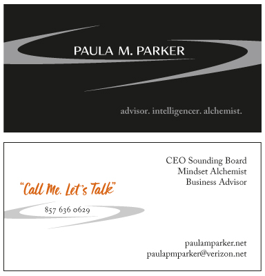
Small and large businesses are still printing business cards, letterhead, brochures, annual reports, newsletters, direct mail pieces and book covers.

Please take a stroll through my print designs. We can meet in person or talk on the phone if you like my design style. Thank you!

Fluence Analytics: Business Card

Fearless Design collaborated with Telesian Technology and members of Fluence Analytics to create a new corporate identity for Fluence Analytics, an innovative data analysis firm in Louisiana. You’ve seen the logo under identity. Here is the business card.

biz-cards

Promotional Card For Artist, Weave Me A Song

Weave Me A Song is a return client. The artist, Jean, wanted an attractive marketing piece she could leave behind at libraries and and hand out at art shows. Jean and I considered about 30 pictures of her artwork and decided on a close-up of a beautiful blue and green weaving for the front and two outdoor photos of full length weavings for the back.  It has contact information for Jean as well as a “notes” area on the bottom in case someone wants to add more details. Jean reports she’s been getting lots of compliments on the marketing piece! Hooray for beautiful art.

artist-card

LTX Corporation, Art Direction, Part I

LTX Corporation needed some images of their semiconductor test equipment to use in brochures, white papers and sales sheets. They asked me to find a good photographer and art direct the shoot. I selected 5 photographers and asked them to come in with their coolest photos. Only one photographer, Sean Hennessy, showed me pictures that wowed me. I hired Sean and we worked together to create unforgettable images of test heads and computer chips, products that don’t normally look cool. To do that, I asked Sean to go in really close like you would to photograph the center of a flower and to try different colored filters. They came out gorgeous.


Computerchip1small

LTX Corporation, Art Direction, Part II

LTX Corporation needed some images of their semiconductor test equipment to use in brochures, white papers and sales sheets. They asked me to find a good photographer and art direct the shoot. I selected 5 photographers and asked them to come in with their coolest photos. Only one photographer, Sean Hennessy, showed me pictures that wowed me. I hired Sean and we worked together to create unforgettable images of test heads and computer chips, products that don’t normally look cool. To do that, I asked Sean to go in really close like you would to photograph the center of a flower and to try different colored filters. They came out gorgeous.


computerchip3small

LTX Corporation, Art Direction, Part III

LTX Corporation needed some images of their semiconductor test equipment to use in brochures, white papers and sales sheets. They asked me to find a good photographer and art direct the shoot. I selected 5 photographers and asked them to come in with their coolest photos. Only one photographer, Sean Hennessy, showed me pictures that wowed me. I hired Sean and we worked together to create unforgettable images of test heads and computer chips, products that don’t normally look cool. To do that, I asked Sean to go in really close like you would to photograph the center of a flower and to try different colored filters. They came out gorgeous.


computerchip2small


Paula Parker: Branding, Logo Design, Tagline, Business Cards.

Paula is a repeat customer. She returned to Fearless Design to get an updated look for her highly successful consulting firm. It was important to Paula that her new logo and card exhibit strength, possibilities and modernism. After collaborating on the project for a month, I created a sleek, slim-cut business card that gets rave reviews whenever she hands it out. I always feel great when the client gets a positive response to the marketing materials produced by Fearless Design.

pp-business-card

BBN Technologies: Tradeshow Recruitment Banner

Super innovative BBN Technologies in Cambridge wanted a cool banner for their upcoming college recruitment trade show. It had to have both a high tech and a fun feel to attract in demand college graduates. In real life, the retractable banner was enormous. Designing really big required me to keep panning in and out – big picture, small picture.

BBN Technologies: Lobby Poster

BBN’s lobby in Cambridge, Mass, needed a welcome poster. It had to incorporate all languages spoken at BBN. It involved quite a bit of researching of languages and translating. The end result turned out very cool!


BBN Technologies: Cocktail Party Invite (Front)

BBN wanted a fun and enticing invite for a customer cocktail party they were holding in New York City. I selected a photo with a pulsing NYC vibe for the front and a skyline for the interior. Party was a smashing success!


BBN Technologies: Cocktail Party Invite (Back)

BBN wanted a fun and enticing invite for a customer cocktail party they were holding in New York City. I selected a photo with a pulsing NYC vibe for the front and a skyline for the interior. Party was a smashing success!


Learning Quest Education: Branding & Copy, Direct Mail Post Card

I met the owner of Learning Question Education at a local chamber of commerce event. She needed a direct mail postcard that illuminated her true fearless difference. We discovered that through my Fearless Why Branding process and made it the cornerstone of the postcard design. Current and potential clients have responded positively to the design and copy.

Lush Landscapes Brochure

I love working with Lush Landscapes because the owner, David, wants all his marketing materials to be beautiful, just like the yardscapes he produces. This fun postcard size brochure unfolds to reveal a path to beauty.


Business Cards

I love designing business cards. They act as a mini-sales force long after you leave them behind. A sophisticated business card will ensure that you stand out from the “designed it myself on a free web site” pack. It also makes you, the business owner, feel proud of your own business. Would you wear a tattered outfit to meet with a client? Think of your card as an extension of your wardrobe. Here are a few samples.


Mercury Communications: Notepad

Notepads make a great promotional item you can leave behind at a sales call, or hand out at a networking event. Mercury Communications, a South Shore writing firm, asked Fearless Design to take their existing logo and design an attractive notepad. The director of Mercury Communications reports that the notepads are a big hit with clients.

Mercury Communications: Notepad

Erica Ferencik, Realtor: Direct Mail Postcard

One of my specialties is direct mail postcards. Clients and their customers love them because they can be mailed at postcard rates, the message is succinct and the call to action is clear. I completed a spring-themed card for Erika Ferencik. She wanted to differentiate her card from the larger cards that real estate agents usually send out. This was done by choosing an eye catching image and giving her clients some free but useful information in the form of a monthly tip.

Erica Ferencik, Realtor: Direct Mail Postcard

LTX Corporation: Corporate Calendar, Art Direction

I designed a tabloid-sized corporate calendar that was sent to every corporate client as well as LTX employees. This collage was based on an annual report I created for them. Additionally, I art directed the photo shoot that produced the gorgeous image on the front. My art direction and design philosophy? Every product can look beautiful and mesmerizing from the right angle.

LTX Corporation: Corporate Calendar, Art Direction

Patricia Peterson: Book Cover

Patricia Peterson, a local fiction author, asked Fearless Design to create a book cover for her suspenseful new novel The Methusalah Conspiracy. I helped Patricia pick out two suitable photographs and blended the images together. Makes you want to follow that girl right into the book …

Patricia Peterson: Book Cover

Smith Leadership Academy: Annual Report, Theme, Design and Copy Writing

For this urban middle school, I came up with the annual report theme, wrote much of the initial copy, and designed this smart looking 20-page report, which had a donation envelope in the middle. I used their corporate colors and the director’s beautiful photos to create a design that reflected the aliveness of the students.


Divine Kitchens: Thank you card, Logo

Divine Kitchens, a kitchen design company, requested a an elegant, yet understated thank you card and envelope for its savvy, suburban clientele.

Divine Kitchens: Thank you card, Logo

The Group Center: Stationery System, Logo, Business cards

Our client was a seasoned, world traveller who wanted her new business venture to exude elegance and sophistication. The energetic logo, sage color, tagline “conversations at the crossroads” and unique layout give this stationery system an Old World look with a New World feel.

The Group Center: Stationery System

Albertina’s: A Bistro of Distinction: Logo & Stationery System

After understanding the way the owners of this trendy, Georgia restaurant wanted to be perceived, I designed a logo and stationery system that exuded a European sensibility with a minimalist feel.

Albertina's: A Bistro of Distinction: Stationery System

Jane Siegel & Associates, Financial Advisors: Logo & Stationery System

Financial services can be known for their stuffy, ultra conservative personas. Jane Siegel wanted to update her successful company’s look. She wanted clients to feel the aliveness and enthusiasm she felt about her own business. I designed a classy, comtemporary stationery system with a splash of vibrant color. She loves the way it makes her feel!

Jane Siegel & Associates, Financial Advisors: Logo & Stationery System

BBN Technologies: Annual Report

For nine years, I collaborated with BBN’s Director of Communication to create a yearly 70-page annual report that was clean, yet cutting edge. Every industry deserves to have beautiful marketing and recruitment materials, an idea that often gets lost at high technology firms. 2015’s strong cover image and rich colors supported the report’s Inventing The Future theme without resorting to cliches.

bbn-2015-cover-small3

Boston Preparatory Charter Public School: Fundraiser invitation & event logo

After I finished creating Boston Prep’s 2008 Annual Report they asked me to design an invite with a unique logo for a spring fundraiser. Since it was to take place at Fenway Park, I came up with a unique twist on the baseball theme. They not only loved it, but also told me the invite brought in positive responses at a far quicker rate than the year before.


Still Point Nutrition: Name, Branding, Logo, Tagline, Business Card

Like most of my vibrant clients, Still Point Nutrition wanted a memorable, sophisticated business card that highlighted the unique experience clients could expect when working with Still Point. After mulling over the questionnaire information, I got the idea to put a beautiful photo of nutritious food on the card and work the clean logo around the photo. The end result? My client and her clients love the business cards! Every time I see this card, I want to make a healthy salad.

Still Point Nutrition: Name, Branding, Logo, Business Card

Smith Worthington, Counselor at Law: Branding, Identity, Business Card, Stationery, Signage

Smith Worthington is a repeat client. They changed their name to reflect a new partnership and asked us to design a new logo and stationery system. After analyzing Smith Worthington’s new branding brief, I decided to kick the elegance up a notch from the original logo. I kept the same rich colors and designed a new logo out of their last two initials. Although the new business card needed lots of information on both sides, I arranged the information in a way that feels roomy.

Smith Worthington, Counselor at Law: Branding, Identity, Business Card, Stationery, Signage

Marketing Department, LTX Corporation: Identity

The director of this engineering division needed a logo for his new software initiative: Open Platform. My challenge was to develop an abstract logo that symbolized the integration of diverse components into a harmonious whole.

Want to be a more fearless business owner?

Start by reading "Why you need a fearless brand!" You'll also receive my monthly e-inspire, Dare to be different! Dare to be you.